A pie chart is a great way of showing the relationship between numbers, especially when showing percentages. Drawing a pie chart from scratch takes a fair amount of maths to get working and so people usually go for third party charting libraries in order to add charts to the page.
I recently came across a technique that allows you to create a pie chart using just CSS, which means you can create simple charts without including massive charting libraries into your page loads. This makes use of just a few lines of CSS, using conic-gradient() CSS function.
The conic-gradient() CSS function is part of the background style attribute and is part of a family of functions like radial-gradient() and linear-gradient(). It is used to create a gradient rotated around a central point and is opposite the radial-gradient() function that draws the gradients radiating away from the centre.
The syntax for drawing conic gradient is actually quite complex, but for the purposes of drawing pie charts we can simplify this complexity quite a bit. All we need to do is tell the gradient to draw segments of the chart as blocks of colour, with each block starting from the exact endpoint of the last segment. This is more of less the syntax we need to follow.
background: conic-gradient(
  color1 from% to%,
  color2 from% to%
)
Using percentages for these values makes the chart easier to create and edit than the alternative units of degrees of radians, which can be a little harder to understand.
As an example, we can draw a 50/50 gradient using the conic-gradient function in the following way.
background: conic-gradient(
  black 0% 50%,
  white 50% 100%
)
That just sets the background colour an element, so in order to get the full effect we also need to set some other style properties. A fixed height and width are useful to ensure the chart is square and we also set the border-radius value to 50%, which turns the block into a circle.
Creating A CSS Pie Chart
Let's create a simple pie chart using what we have learned so far. First, we need to create a div that we can target to create the chart.
<div class="pie"></div>
We can then create the styles needed to turn this into a pie chart. In the following example we are setting up a pie chart with four colours (red, blue, violet and green) of different sizes.
.pie {
  width: 200px;
  height: 200px;
  background: conic-gradient(
    red 0% 31%,
    blue 31% 50%,
    violet 50% 75%,
    green 75% 100%
  );
  border-radius: 50%;
}
This results in the following output.
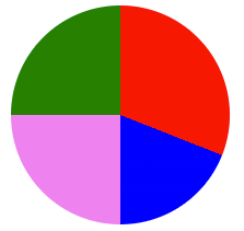
As you can see, this works very well.
A better approach to creating the chart is to create a generic set of styles for the pie charts we want to create and then inject the background styles as an inline set of styles. This means we can generate multiple different pie charts containing different data.
Here are the core styles we need to generate our CSS pie chart, but without the actual data in the background attribute.
.inline-pie {
  width: 200px;
  height: 200px;
  border-radius: 50%;
}
The HTML we generate then contains the class to add in the background conic-gradient styles to create the data display for the chart.
<div class="inline-pie" style="background: conic-gradient(red 0% 31%,blue 31% 50%,violet 50% 75%,green 75% 100%);"></div>
This allows us to create multiple different pie charts on the same page by just injecting the data into the relevant div.
The technique here works well, but only works well for sites without dynamic content. Let's take this a step further and use JavaScript to generate the data we need.
Using JavaScript To Generate CSS Pie Charts
A single JavaScript function is enough to generate the effect we need in conjunction with the generic pie chart styles to set the basic shape of the pie chart.
The two parameters we pass to the function are a class name that identifies the element we want to generate the chart data itself (including the colours). All the function does is map the data to the percentage value and generate the conic-gradient value using these values. This is then applied to the background style of the element.
function pieChart(className, chartData) {
  let jspie = document.getElementsByClassName(className)[0];

  let map = function(value, valueRangeStart, valueRangeEnd, newRangeStart, newRangeEnd) {
    return newRangeStart + (newRangeEnd - newRangeStart) * ((value - valueRangeStart) / (valueRangeEnd - valueRangeStart));
  };

  let total = 0;
  let length = 0;
  let last_value = 0;
  let background = '';
  let number = 0;

  for (var item in chartData) {
    length++;
    total += chartData[item].data;
  }

  for (var item in chartData) {
    let value = Math.round(map(chartData[item].data, 0, total, 0, 100));
    value += last_value;
    background += chartData[item].colour + ' ' + last_value + '% ' + value + '%';
    if (number < length - 1) {
      background += ',';
    }
    last_value = value;
    number++;
  }

  jspie.style.background = ' conic-gradient(' + background + ')';
}
The chart data contains the value and the colour to apply to the segment.
let data = {
  0 : {
    'data': 25,
    'colour': 'red'
  },
  1 : {
    'data': 15,
    'colour': 'blue'
  },
  2: {
    'data': 20,
    'colour': 'violet'
  },
  3: {
    'data': 20,
    'colour': 'green'
  }
}

pieChart('js-pie', data);
The HTML needed to generate the pie chart would be as follows.
<div class="inline-pie js-pie"></div>
Using this code we can now generate multiple pie charts on a page using just these elements.
If you want to see all of the previous examples in action then check out the CodePen I created that contains all of the code seen here. This creates a pie chart using full external styles, the generic styles and an inline component, and the JavaScript method of generating the chart.
Fixing Accessibility
The big problem with showing a pie chart in this way is that it is not accessible at all. This is somewhat understandable due to the way it's created, but screen readers will simply not register the presence of the pie chart and will just ignore it.
A solution to this is to inject aria-* attributes into the markup in order to show the presence of visual representation of data on the page. Rather than just add lots of text to a single aria-label of the main div we can make things more interesting by adding separate elements that represent the data.
Let's start with a more accessible root element that we can use to inject the pie chart into.
<div class="inline-pie js-pie" aria-label="Pie chart showing the relationship between values.">
</div>
Our intent here is to generate inner div elements that will display the data of the pie chart. In order to do this we need to ensure that each of the inner elements sit on top of each other so that they still represent the data in the same way. The following styles handle this by showing the inner elements in an absolute position, relative to the outer div.
.inline-pie {
  position: relative;
  width: 200px;
  height: 200px;
  border-radius: 50%;
}

.inline-pie div {
  position: absolute;
  top: 10px;
  width: 200px;
  height: 200px;
  border-radius: 50%;
}
Next, we need to alter the pieChart() JavaScript function so that instead of creating a single background style we generate a set of div elements, each of which contain their own styles and aria-label attributes.
function pieChart(className, chartData) {
  let jspie = document.getElementsByClassName(className)[0];

  let map = function(value, valueRangeStart, valueRangeEnd, newRangeStart, newRangeEnd) {
    return newRangeStart + (newRangeEnd - newRangeStart) * ((value - valueRangeStart) / (valueRangeEnd - valueRangeStart));
  };

  let total = 0;
  let length = 0;
  let last_value = 0;

  for (var item in chartData) {
    length++;
    total += chartData[item].data;
  }

  for (var item in chartData) {
    let background = '';

    let value = Math.round(map(chartData[item].data, 0, total, 0, 100));

    var new_element = document.createElement('div');
    new_element.setAttribute('aria-label', chartData[item].label + ' ' + value + '%')

    value += last_value;
    if (last_value > 0) {
      background += 'transparent 0% ' + last_value + '%,';
    }

    background += chartData[item].colour + ' ' + last_value + '% ' + value + '%';
    background += ',transparent ' + value + '% 100%';

    new_element.style.background = ' conic-gradient(' + background + ')';

    jspie.append(new_element);

    last_value = value;
  }
}

pieChart('js-pie', data);
To make this work we just need to alter the data array slightly to inject a label into the data. This is used to inject the aria-label attributes to the markup.
let data = {
  0 : {
    'data': 25,
    'label': 'Red',
    'colour': 'red'
  },
  1 : {
    'data': 15,
    'label': 'Blue',
    'colour': 'blue'
  },
  2: {
    'data': 20,
    'label': 'Violet',
    'colour': 'violet'
  },
  3: {
    'data': 20,
    'label': 'Green',
    'colour': 'green'
  }
}
Running this code generates the following HTML. The aria-label elements here explain both the purpose of the chart and the data items within it.
<div class="inline-pie js-pie" aria-label="Pie chart showing the relationship between values.">
  <div aria-label="Red 31%" style="background: conic-gradient(red 0%, red 31%, transparent 31%, transparent 100%);"></div>
  <div aria-label="Blue 19%" style="background: conic-gradient(transparent 0%, transparent 31%, blue 31%, blue 50%, transparent 50%, transparent 100%);"></div>
  <div aria-label="Violet 25%" style="background: conic-gradient(transparent 0%, transparent 50%, violet 50%, violet 75%, transparent 75%, transparent 100%);"></div>
  <div aria-label="Green 25%" style="background: conic-gradient(transparent 0%, transparent 75%, green 75%, green 100%, transparent 100%, transparent 100%);"></div>
</div>
You can find an example of this, more accessible version of the pie chart generation script in a separate CodePen. You can make the charts more independent of the page structure by making them into web components.
Generally, these pie charts should be used to show the relationship between two pieces of information in a confined space. They should act more or less like sparklines, which show very simple relationships within content these pie charts can be used to quickly represent some data within content. If you want to create more complex pie charts then there are plenty of charting libraries available that provide better functionality than this simple approach.
If you want to learn more about the conic-gradient function in CSS then the mdn web docs have an extensive page on the subject.

Comments
This is a great resource on creating simple pie charts using CSS! It covers the pros and cons of pie charts, and provides a step-by-step guide on how to create them with CSS conic gradients. I especially liked the part about making the charts accessible with aria-labels. Overall, this is a well-written and informative article that's perfect for anyone who wants to learn how to create simple pie charts using CSS.
Submitted by Mandy on Fri, 04/12/2024 - 15:29
PermalinkAdd new comment